In this post, I analyze the Powerlifting dataset from TidyTuesday, a project that shares a new dataset each week to give R users a way to apply and practice their skills. This week’s data is about the results of powerlifting events that are part of the International Powerlifting Federation. I will be predicting bench press weight with a multiple linear regression model. What’s more, I will be using natural cubic splines to incorporate non-linear trends into our model.
Setup
First, we’ll load our packages, set our default ggplot2 theme, and import our data. We’re loading to packages, in addition to the tidyverse:
broomto clean up the output of modelling functions likelmsplinesso that we can add natural cubic splines to our linear regression model (I’ll provide a short, non-rigorous explanation of splines during the modelling step)
library(tidyverse)
library(broom)
library(splines)

theme_set(theme_light())

ipf_lifts_raw <- readr::read_csv("https://raw.githubusercontent.com/rfordatascience/tidytuesday/master/data/2019/2019-10-08/ipf_lifts.csv")
Data inspection
What have we got?
ipf_lifts_raw %>%
  glimpse()
## Rows: 41,152
## Columns: 16
## $ name <chr> "Hiroyuki Isagawa", "David Mannering", "Eddy Penge...
## $ sex <chr> "M", "M", "M", "M", "M", "M", "M", "M", "M", "M", ...
## $ event <chr> "SBD", "SBD", "SBD", "SBD", "SBD", "SBD", "SBD", "...
## $ equipment <chr> "Single-ply", "Single-ply", "Single-ply", "Single-...
## $ age <dbl> NA, 24.0, 35.5, 19.5, NA, NA, 32.5, 31.5, NA, NA, ...
## $ age_class <chr> NA, "24-34", "35-39", "20-23", NA, NA, "24-34", "2...
## $ division <chr> NA, NA, NA, NA, NA, NA, NA, NA, NA, NA, NA, NA, NA...
## $ bodyweight_kg <dbl> 67.5, 67.5, 67.5, 67.5, 67.5, 67.5, 67.5, 90.0, 90...
## $ weight_class_kg <chr> "67.5", "67.5", "67.5", "67.5", "67.5", "67.5", "6...
## $ best3squat_kg <dbl> 205.0, 225.0, 245.0, 195.0, 240.0, 200.0, 220.0, 2...
## $ best3bench_kg <dbl> 140.0, 132.5, 157.5, 110.0, 140.0, 100.0, 140.0, 2...
## $ best3deadlift_kg <dbl> 225.0, 235.0, 270.0, 240.0, 215.0, 230.0, 235.0, 3...
## $ place <chr> "1", "2", "3", "4", "5", "6", "7", "1", "2", "2", ...
## $ date <date> 1985-08-03, 1985-08-03, 1985-08-03, 1985-08-03, 1...
## $ federation <chr> "IPF", "IPF", "IPF", "IPF", "IPF", "IPF", "IPF", "...
## $ meet_name <chr> "World Games", "World Games", "World Games", "Worl...We have three categories of data:
- Competitor: name, sex, age, and weight.
- Event: the event type (i.e., what type of lifting), division, age and weight classes, and the name and date of the meet the event was a part of.
- Results: best lift amounts for the three types of lifts (squat, bench, and deadlift) and the competitor’s place in the event.
Let’s do an exploratory visualization. This data is about lifting, so I want to know much people could lift! There are two main events in this data: Bench-only (B) and Squat-Bench-Deadlift (SBD), also known as “Full Power”. I want a broad overview, so let’s stick to SBD since it gives us three types of lifts. Also, we won’t worry about making our graph too pretty, since we’re still just exploring. Cleaning up and tweaking our graphs would take too much time.
ipf_lifts_raw %>%
  filter(event == "SBD") %>%
  pivot_longer(cols = best3squat_kg:best3deadlift_kg,
               names_to = "lift_type",
               names_prefix = "best3",
               values_to = "kg_lifted") %>%
  ggplot(aes(lift_type, kg_lifted, fill = equipment)) +
  geom_boxplot(outlier.alpha = 0.5) +
  facet_wrap(~ sex)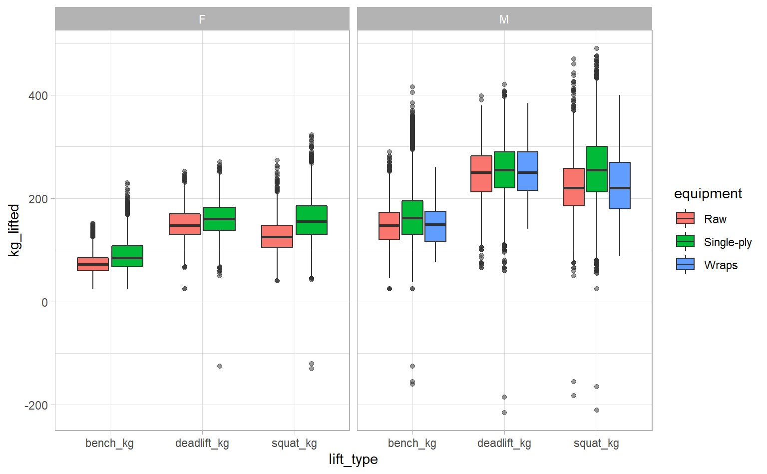
Some competitors had negative lift weights – impressive! Investigating this gives us an excuse to use filter_at, which lets us apply the same filter to multiple fields at once.
ipf_lifts_raw %>%
  filter_at(vars(best3squat_kg, best3bench_kg, best3deadlift_kg), # Fields to filter
            any_vars(. < 0)) %>% # Use . as a placeholder for the field name
  select(best3squat_kg:place)
## # A tibble: 12 x 4
## best3squat_kg best3bench_kg best3deadlift_kg place
## <dbl> <dbl> <dbl> <chr>
## 1 -165 NA NA DQ
## 2 135 52.5 -125 DQ
## 3 -155 NA NA DQ
## 4 -182. NA NA DQ
## 5 NA -155 NA DQ
## 6 222. NA -215 DQ
## 7 -120 72.5 105 DQ
## 8 -130 NA NA DQ
## 9 220 120 -185 DQ
## 10 198. -125 NA DQ
## 11 200 -160 NA DQ
## 12 -210 NA NA DQThere are 12 observations with negative lift weights and all of them are DQ – disqualified. There could be some meaning to the negative weights or they could just be entry errors, but in either case I think we’re fine to exclude these observations. Let’s re-run our exploratory graph.
ipf_lifts_raw %>%
  filter(event == "SBD") %>%
  pivot_longer(cols = best3squat_kg:best3deadlift_kg,
               names_to = "lift_type",
               names_prefix = "best3",
               values_to = "kg_lifted") %>%
  filter(kg_lifted > 0) %>% # WE JUST ADDED THIS FILTER
  ggplot(aes(lift_type, kg_lifted, fill = equipment)) +
  geom_boxplot(outlier.alpha = 0.5) +
  facet_wrap(~ sex)
We can already make a few observations on this dataset:
- Men tend to lift more than women
- Bench weights are typically less than deadlifts or squats, which are about equal
- Competitors tend to lift more with single-ply, compared to raw or wrapped lifting (more on the difference here)
- Only men used wraps
The fact that only men used wraps is suspicious, so let’s dig deeper.
ipf_lifts_raw %>%
  count(sex, equipment)
## # A tibble: 5 x 3
## sex equipment n
## <chr> <chr> <int>
## 1 F Raw 2904
## 2 F Single-ply 10348
## 3 M Raw 4663
## 4 M Single-ply 22961
## 5 M Wraps 276We only have 276 observations where “wraps” was used as the equipment. The vast majority of lifts were done raw or with single-ply equipment. Since they account for so few lifts, we are probably safe to exclude wraps from our analysis.
Research question
What should we do with this data? Well, in high school and university, some of my gym-going classmates were preoccupied with one question: How much can you bench? So let’s try to answer that question for them.
Data cleaning
Fortunately, this data is already pretty good, so we don’t have a lot to clean. We’ll still do three things, though:
- Ditch fields that we aren’t interested in, only keeping bench weight and a few potential predictors.
- Rename some fields so they’re nicer to work with.
- Filter out missing or erroneous data among the fields we want to use to predict bench weight. Specifically, we’re going to exclude rows where the bench weight is negative or the age is less than 16.
ipf_lifts <- ipf_lifts_raw %>%
  # transmute acts like a combination of select and mutate
  transmute(name,
            sex,
            equipment,
            age,
            weight_kg = bodyweight_kg,
            bench_kg = best3bench_kg) %>%
  # Filter out missing observations in age, weight, or bench weight
  filter_at(vars(age, weight_kg, bench_kg),
            all_vars(!is.na(.))) %>%
  filter(equipment != "Wraps",
         bench_kg > 0,
         age >= 16)
Modelling
Exploring the predictors
We’re going to build a multivariate linear regression model. But before diving into it, let’s visualize what we have to get a sense of the relationship between our response variable (bench weight) and our predictors. How do competitor weight, sex, and equipment relate to bench weight?
ipf_lifts %>%
  ggplot(aes(weight_kg, bench_kg)) +
  geom_point(alpha = 0.2) +
  facet_grid(equipment ~ sex)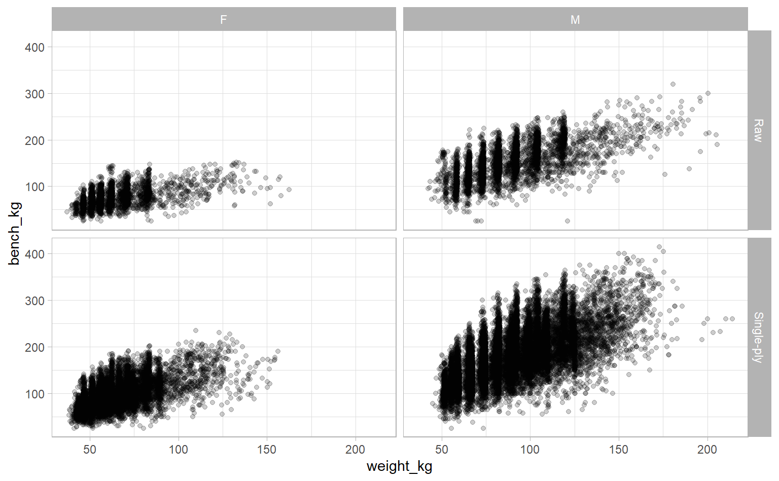
There’s a pretty clear linear relationship. You can also see that men tend have higher bench weights than women, there are more men over 150kg (compared to almost no women), and that there is more variation in bench weight when using single-ply equipment (among both sexes).
What if we look at age instead of weight?
ipf_lifts %>%
  ggplot(aes(age, bench_kg)) +
  geom_point(alpha = 0.2) +
  # Adding axis breaks every 10 years
  scale_x_continuous(breaks = seq(10, 90, 10)) +
  facet_grid(equipment ~ sex)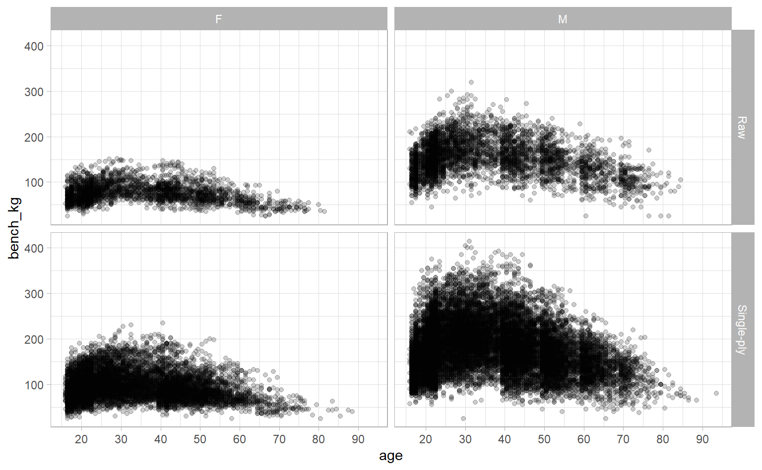
Interesting. There’s a clear relationship, but it’s not linear. It looks like competitors tend to lift more as they get older, until they peak in their 30s, then decline from there. Instead of eyeballing, though, we can add a loess-fitted smoothing line with geom_smooth to get a sense of the general trend of the data.
ipf_lifts %>%
  ggplot(aes(age, bench_kg)) +
  geom_point(alpha = 0.2) +
  scale_x_continuous(breaks = seq(10, 90, 10)) +
  # Same code as above -- we just added geom_smooth
  geom_smooth(method = "loess", col = "red") +
  facet_grid(equipment ~ sex)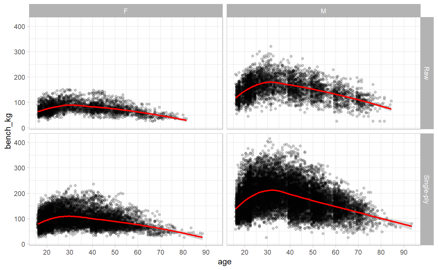
Now it’s super obvious, right?
Okay, last thing to explore before building our model is the relationship between age and weight. If they’re highly correlated then that can cause issues with our regression. We’ll check visually and mathematically (using the cor function).
ipf_lifts %>%
  ggplot(aes(age, weight_kg)) +
  geom_point(alpha = 0.2) +
  scale_x_continuous(breaks = seq(10, 90, 10)) +
  facet_wrap(~ sex)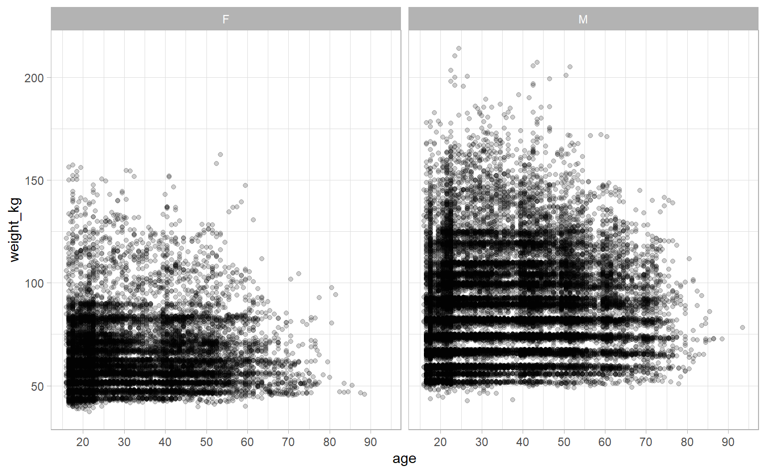
cor(ipf_lifts$age, ipf_lifts$weight_kg)## [1] 0.06776009The correlation’s very low. Though it is interesting we see fewer heavier competitors as age increases.
Building the model
We have a good idea about the relationship between bench weight and our predictors, so let’s take a moment to note what those relationships are. After we run our regression, we can check its output to see how well it lines up with our intuition.
- Sex: men tended to lift more than women
- Weight: heavier competitors tended to lift more than lighter competitors
- Equipment: equipped competitors (“Single-Ply”) tended to lift more than unequipped (“Raw”) competitors
- Age: competitors tended to lift the most in their 30s, but less if they were younger or older
Age is a bit weird because it has that non-linear trend, but let’s include it in our first model. Don’t worry, we’ll sort out that non-linear trend, soon.
first_model <- lm(bench_kg ~ sex + weight_kg + equipment + age,
                  data = ipf_lifts)

summary(first_model)
##
## Call:
## lm(formula = bench_kg ~ sex + weight_kg + equipment + age, data = ipf_lifts)
##
## Residuals:
## Min 1Q Median 3Q Max
## -169.892 -21.807 -1.743 19.644 149.353
##
## Coefficients:
## Estimate Std. Error t value Pr(>|t|)
## (Intercept) 7.805439 0.820466 9.513 <2e-16 ***
## sexM 53.403462 0.432975 123.341 <2e-16 ***
## weight_kg 1.274897 0.008197 155.526 <2e-16 ***
## equipmentSingle-ply 24.945502 0.451533 55.246 <2e-16 ***
## age -0.573199 0.012551 -45.671 <2e-16 ***
## ---
## Signif. codes: 0 '***' 0.001 '**' 0.01 '*' 0.05 '.' 0.1 ' ' 1
##
## Residual standard error: 34.28 on 35265 degrees of freedom
## Multiple R-squared: 0.6793, Adjusted R-squared: 0.6793
## F-statistic: 1.868e+04 on 4 and 35265 DF, p-value: < 2.2e-16I dream of getting initial results this good! All of our predictors are statistically significant and we have an adjusted R-squared of 0.6793, which means that about 68% of the variance in bench weight is “explained” by these predictors. Everything lines up with our intuition, too:
- Sex: men are expected to lift about 53.4kg more than women
- Weight: competitors are expected to lift 1.3kg more for every additional 1kg of bodyweight
- Equipment: equipped competitors are expected to lift about 24.9kg more than unequipped competitors
- Age: older competitors are expected to lift less by about 0.6kg for every year of age
Let’s dig into age by looking at the relationship between age and the residuals from our model. A properly-specified model won’t have any clear patterns in this plot.
first_model %>%
  augment() %>%
  ggplot(aes(age, .resid)) +
  geom_point(alpha = 0.2) +
  geom_hline(aes(yintercept = 0), col = "red") +
  scale_x_continuous(breaks = seq(10, 90, 10))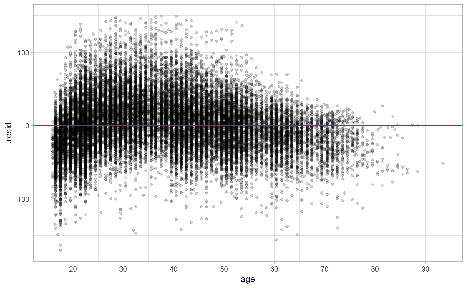
But we do see a pattern. We’re overestimating bench weight for younger (in their teens and 20s) and older (aged 50+) competitors. Or, put another way, there is signal left over that our model hasn’t captured.
Capturing non-linearity using natural cubic splines
How do we capture this signal? One method is to use natural cubic splines. The very, very unscientific explanation of splines is that they split a straight line into chunks and stretch each of those chunks without affecting the others. Doing this lets us add some wiggle to a straight line. The amount we let a line wiggle is determined by the degrees of freedom – the higher the degrees of freedom, the more wiggle. Let’s look at age versus bench weight for splines with between 1 and 9 degrees of freedom.
splines <- tibble(degrees_of_freedom = 1:9) %>%
  mutate(linear_model = map(degrees_of_freedom,
                            ~ lm(bench_kg ~ ns(age, df = .), data = ipf_lifts)))

splines %>%
  mutate(augmented = map(linear_model, augment, data = ipf_lifts)) %>%
  unnest(augmented) %>%
  ggplot(aes(age, bench_kg)) +
  geom_point(data = ipf_lifts, alpha = 0.1) +
  geom_line(aes(y = .fitted), col = "red") +
  scale_x_continuous(breaks = seq(10, 90, 10)) +
  facet_wrap(~ degrees_of_freedom)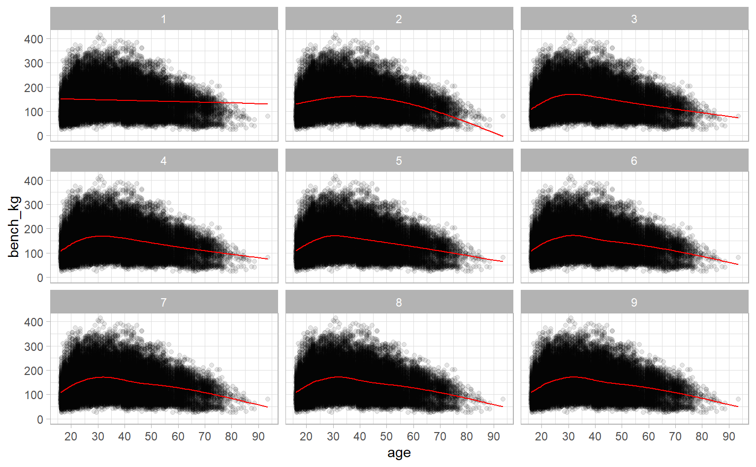
One degree of freedom is just a straight line, but as we move to 2, 3, and more degrees of freedom, the line gets more wiggle. But you can also see reach a plateau where allowing for more degrees of freedom doesn’t help us that much. Once we get to 3 or 4, the wigglier lines don’t describe the trend much better.
Good news! We can quantify how well each spline with different degrees of freedom fit the trend we see in each. Each of those red lines is its own linear regression, so we can use evaluation metrics like adjusted R-squared and Akaike Information Criterion (AIC). Both of these give a sense of how well a model fits a dataset while adjusting for overfitting. (Note: “better” models will have a higher adjusted R-squared and a lower AIC.)
splines %>%
  mutate(glanced = map(linear_model, glance, data = ipf_lifts)) %>%
  unnest(glanced) %>%
  select(degrees_of_freedom, adj.r.squared, AIC) %>%
  pivot_longer(adj.r.squared:AIC) %>%
  ggplot(aes(degrees_of_freedom, value)) +
  geom_point() +
  geom_line() +
  scale_x_continuous(breaks = 1:9) +
  facet_wrap(~ name, scales = "free_y") +
  theme(panel.grid.minor = element_blank())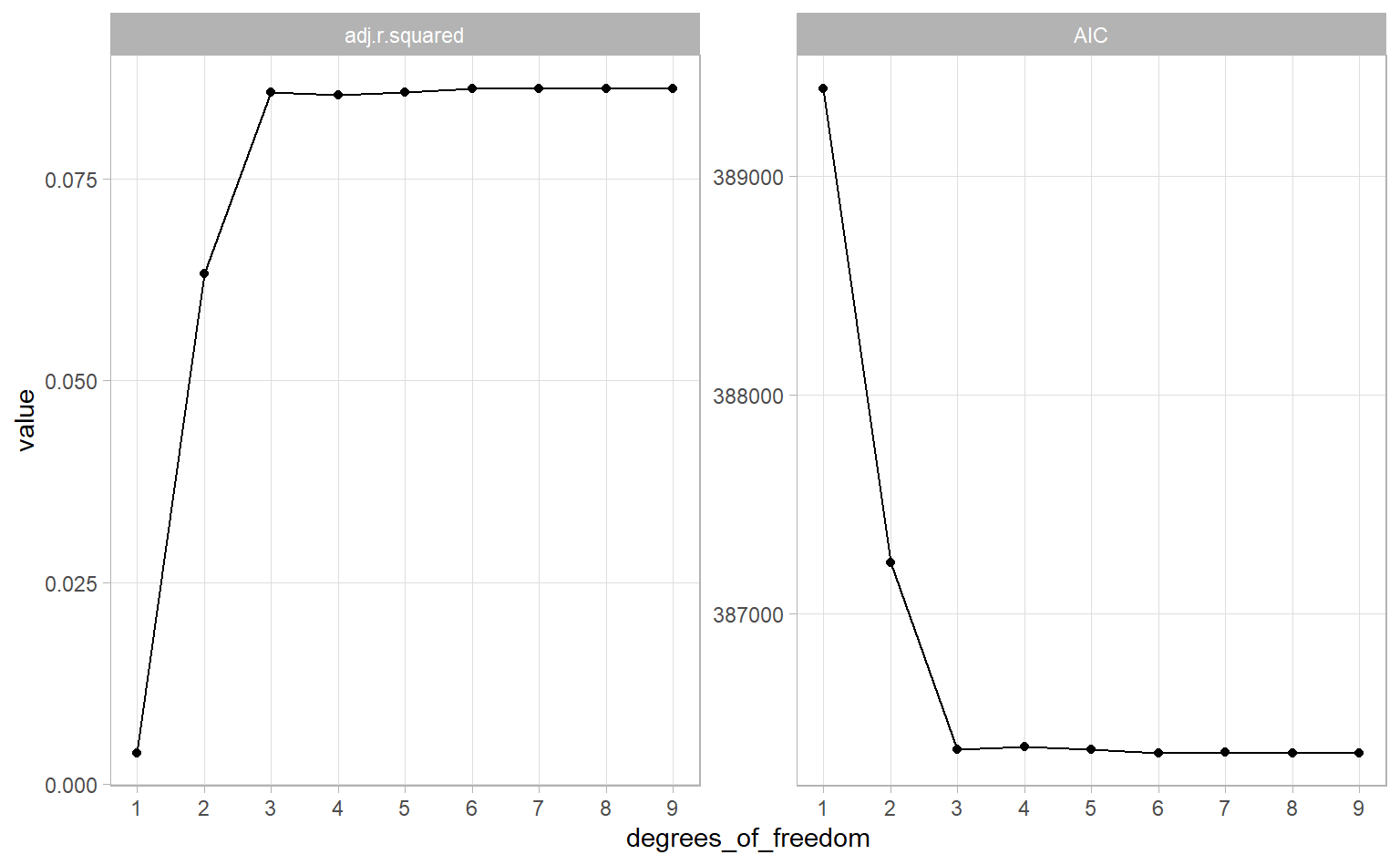
Both metrics tell a similar story – our fit gets better until we hit 3 degrees of freedom, then our model plateaus. This suggests that 3 degrees of freedom is a good predictor to use in our linear model. So let’s do that and see what we get.
splines_model <- lm(bench_kg ~ sex + weight_kg + equipment + ns(age, 3),
                    data = ipf_lifts)

summary(splines_model)
##
## Call:
## lm(formula = bench_kg ~ sex + weight_kg + equipment + ns(age,
## 3), data = ipf_lifts)
##
## Residuals:
## Min 1Q Median 3Q Max
## -162.898 -20.050 -1.177 18.591 145.532
##
## Coefficients:
## Estimate Std. Error t value Pr(>|t|)
## (Intercept) -28.813853 0.789781 -36.483 <2e-16 ***
## sexM 55.108550 0.398513 138.285 <2e-16 ***
## weight_kg 1.202917 0.007583 158.633 <2e-16 ***
## equipmentSingle-ply 23.311848 0.415730 56.075 <2e-16 ***
## ns(age, 3)1 -15.867676 1.018444 -15.580 <2e-16 ***
## ns(age, 3)2 18.009630 1.802302 9.993 <2e-16 ***
## ns(age, 3)3 -81.655238 2.211188 -36.928 <2e-16 ***
## ---
## Signif. codes: 0 '***' 0.001 '**' 0.01 '*' 0.05 '.' 0.1 ' ' 1
##
## Residual standard error: 31.48 on 35263 degrees of freedom
## Multiple R-squared: 0.7296, Adjusted R-squared: 0.7296
## F-statistic: 1.586e+04 on 6 and 35263 DF, p-value: < 2.2e-16We lose some interpretability, since the estimates for each of the spline parameters aren’t obvious, but we seem to end up with a better model: an adjusted R-squared of 0.7296 compared to an adjusted R-squared of 0.6793 with our first model. Splines are pretty neat!
Conclusion
I hope you got a good sense of multivariate linear regression and how we can use natural cubic splines to account for non-linear trends. But, you should know, this model isn’t perfect. To be truly rigorous, we should have investigated and addressed the model’s heteroscedasticity. We should have also used cross-validation to get more robust estimates. I’m sure we’ll get to address those – probably with a different dataset – in a future post.
If you liked this, check out the #TidyTuesday hashtag on Twitter. People make truly wonderful contributions every week. Even better would be to participate in TidyTuesday. The R community is tremendously positive and supportive.