In this post, I create heat maps using the Philly Parking Tickets dataset from TidyTuesday, a project that shares a new dataset each week to give R users a way to apply and practice their skills.
Specifically, we’ll cover:
- Cleaning and aggregating the data that will go into our heat map
- Creating a basic heat map with
ggplot2defaults - Tweaking
ggplot2theme components to get a much prettier heat map
Setup
We’ll load a few packages in addition to the tidyverse:
lubridateto work with dates and timesextrafontto change the font on our graphsscalesto easily change number formats (e.g., 0.32 becomes 32%)viridisas a nice alternative to defaultggplot2colours
library(tidyverse)
library(lubridate)
library(extrafont)
library(scales)
library(viridis)

theme_set(theme_light())

tickets_raw <- readr::read_csv("https://raw.githubusercontent.com/rfordatascience/tidytuesday/master/data/2019/2019-12-03/tickets.csv")
Data inspection
Let’s get into these parking tickets.
tickets_raw %>%
  glimpse()
## Rows: 1,260,891
## Columns: 7
## $ violation_desc <chr> "BUS ONLY ZONE", "STOPPING PROHIBITED", "OVER TIME L...
## $ issue_datetime <dttm> 2017-12-06 12:29:00, 2017-10-16 18:03:00, 2017-11-0...
## $ fine <dbl> 51, 51, 26, 26, 76, 51, 36, 36, 76, 26, 26, 301, 36,...
## $ issuing_agency <chr> "PPA", "PPA", "PPA", "PPA", "PPA", "POLICE", "PPA", ...
## $ lat <dbl> 40.03550, 40.02571, 40.02579, 40.02590, 39.95617, 40...
## $ lon <dbl> -75.08111, -75.22249, -75.22256, -75.22271, -75.1660...
## $ zip_code <dbl> 19149, 19127, 19127, 19127, 19102, NA, NA, 19106, 19...The unit of observation is a parking ticket, and we have over 1.2 million of them. I also see three categories of data:
- Ticket: the basics of the ticket, like what it was for, the fine amount, and who issued it.
- Time: when it was issued. This dataset has tickets for 2017 only.
- Location: where it was issued.
Which are the most common violations?
tickets_raw %>%
  count(violation_desc, sort = TRUE) %>%
  head(20) %>%
  mutate(violation_desc = fct_reorder(violation_desc, n)) %>%
  ggplot(aes(violation_desc, n, fill = violation_desc)) +
  geom_col() +
  scale_fill_viridis(discrete = TRUE, direction = -1) +
  scale_y_continuous(labels = comma_format()) +
  coord_flip() +
  theme(legend.position = "none")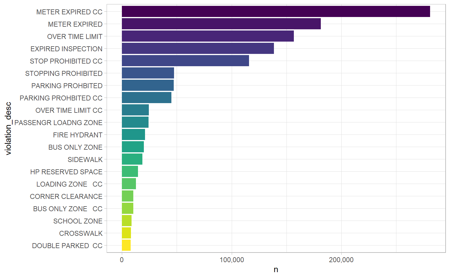
“METER EXPIRED” and “METER EXPIRED CC” are the two most common. Is there any difference between them? Other violations seem the same, too, except for that “CC” at the end. Let’s use a cool trick to look at a couple of them: if we group by violation_desc, we can then use the sample_n function to get random observations from each group. It’s handy for spot-checking or investigating weird values like these.
# Set seed for reproducible sampling
set.seed(24601)

tickets_raw %>%
  # Look at two violation descriptions
  # Note the regex on PROHIBITED to capture slightly different spellings
  filter(str_detect(violation_desc, "METER EXPIRED|PARKING PROHI?BITED")) %>%
  group_by(violation_desc) %>%
  sample_n(2)
## # A tibble: 10 x 7
## # Groups: violation_desc [5]
## violation_desc issue_datetime fine issuing_agency lat lon zip_code
## <chr> <dttm> <dbl> <chr> <dbl> <dbl> <dbl>
## 1 METER EXPIRED 2017-05-27 08:13:00 26 PPA 40.0 -75.1 19124
## 2 METER EXPIRED 2017-02-10 15:45:00 26 PPA 40.0 -75.2 19104
## 3 METER EXPIRED ~ 2017-07-20 18:45:00 36 PPA 40.0 -75.2 19107
## 4 METER EXPIRED ~ 2017-08-09 18:28:00 36 PPA 40.0 -75.2 NA
## 5 PARKING PROHBI~ 2017-10-06 11:59:00 41 PPA 40.0 -75.2 NA
## 6 PARKING PROHBI~ 2017-09-19 11:33:00 41 PPA 40.0 -75.2 19130
## 7 PARKING PROHBI~ 2017-05-04 11:40:00 51 PPA 39.9 -75.2 19107
## 8 PARKING PROHBI~ 2017-08-25 14:08:00 51 PPA 40.0 -75.2 19103
## 9 PARKING PROHIB~ 2017-09-07 11:50:00 31 SEPTA 40.0 -75.1 19140
## 10 PARKING PROHIB~ 2017-08-12 06:50:00 31 TEMPLE 40.0 -75.2 19140The main difference is the fine amount, but “PARKING PROHIBITED” (with its slightly different spelling) has a different issuing_agency. Some quick research makes me think that CC stands for “City Centre”. That would jive with the higher fine amounts – higher fines for violations downtown.
Fortunately, we have location data, so we can test this hypothesis. We’ll use longitude and latitude to make a crude map of violation types (with CC vs. without CC) and see if the results are consistent with “CC” meaning “City Centre”.
tickets_raw %>%
  filter(str_detect(violation_desc, "METER EXPIRED"),
         # Exclude outlier longitude values
         lon > -75.5) %>%
  group_by(violation_desc) %>%
  # Only take 1000 observations -- more takes longer to plot
  sample_n(1e4) %>%
  ggplot(aes(lon, lat, col = violation_desc)) +
  # Shape of . is small, so it alleviates overplotting
  geom_point(shape = ".")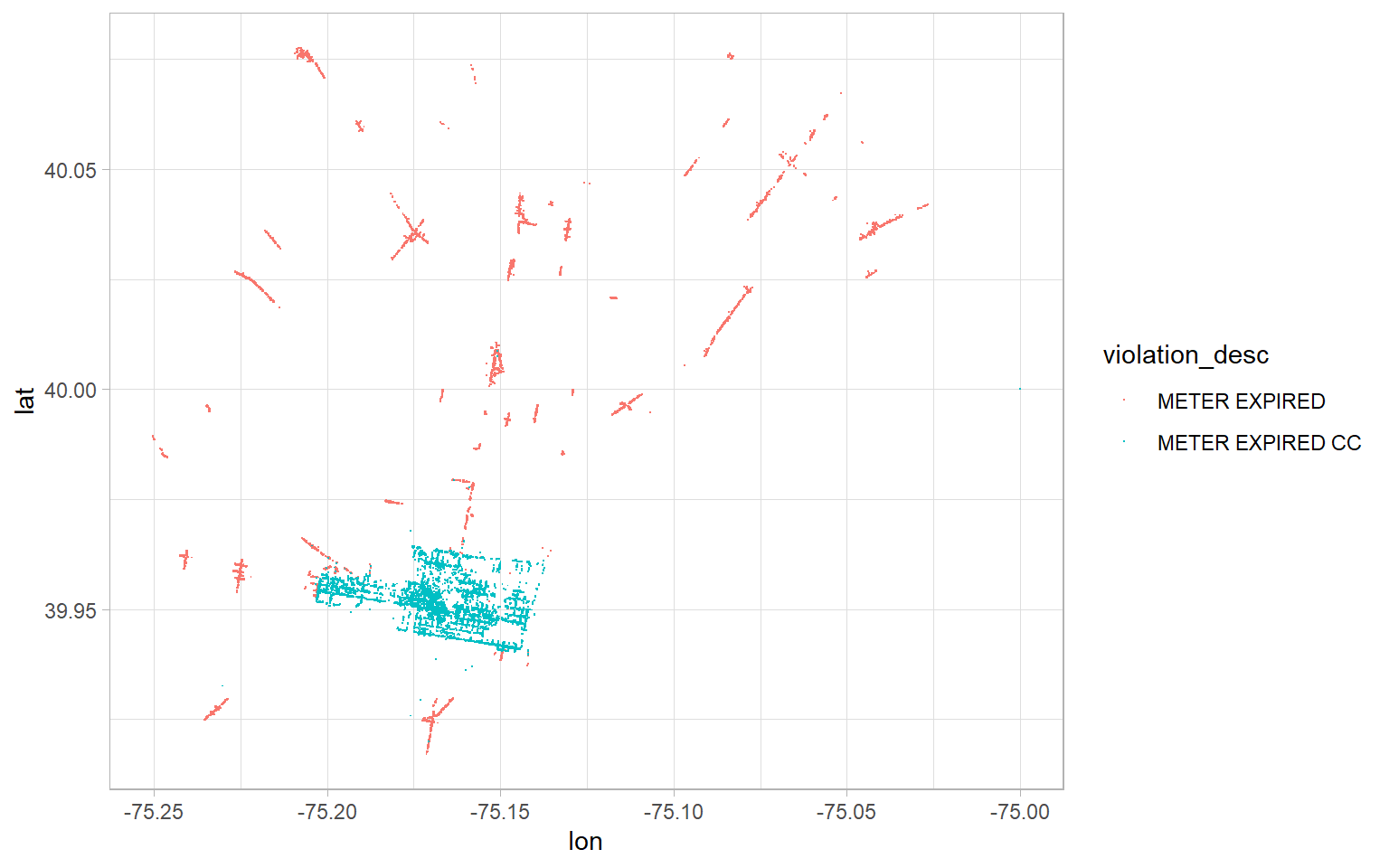
Bingo! That concentration of blue dots looks like a city centre to me. I think we’ve got a good enough feel for our data to decide what we want to do with it.
Research question
I’m sure everyone has parked somewhere they shouldn’t have. Whenever I’ve done that, I always worry: “Will I get away with it?” If I parked illegally late at night on a Sunday, I’d be less worried about getting a ticket than if I parked illegaly on a Tuesday afternoon. Would I be right to be less worried? Let’s visualize the relationship between time and tickets with a heat map to find out. Specifically, let’s look at day of the week and time of the day.
Data cleaning and preparation
We’re going to perform four cleaning steps:
- Remove “CC” from
violation_desc. We’ll consider violations the same, regardless of whether they were in the city centre or not. - Correct some short-form spellings in
violation_desc. For example we’ll add the “E” back into “PASSENGR”. - Derive day-of-week and hour-of-day from
issue_datetime. We need these to be the nodes of our heat map. - Ditch
fine,issuing_agency, and location data. We won’t be using these.
tickets <- tickets_raw %>%
  # Remove "CC" and correct spelling
  mutate(violation_desc = str_squish(str_remove(violation_desc, " CC")),
         violation_desc = str_replace_all(violation_desc,
                                          c("PASSENGR" = "PASSENGER",
                                            "PROHBITED" = "PROHIBITED",
                                            "LOADNG" = "LOADING"))) %>%
  # Derive features -- we're setting Mon as the first day of the week
  mutate(day_of_week = wday(issue_datetime, label = TRUE, week_start = 1),
         issue_hour = hour(issue_datetime)) %>%
  select(-fine:-zip_code)

# Look at our clean data
tickets %>%
  head()
## # A tibble: 6 x 4
## violation_desc issue_datetime day_of_week issue_hour
## <chr> <dttm> <ord> <int>
## 1 BUS ONLY ZONE 2017-12-06 12:29:00 Wed 12
## 2 STOPPING PROHIBITED 2017-10-16 18:03:00 Mon 18
## 3 OVER TIME LIMIT 2017-11-02 22:09:00 Thu 22
## 4 OVER TIME LIMIT 2017-11-05 20:19:00 Sun 20
## 5 STOP PROHIBITED 2017-10-17 06:58:00 Tue 6
## 6 DOUBLE PARKED 2017-10-02 10:40:00 Mon 10It’s a simple dataset, but it’s all we need for a heat map.
Visualizing
We can use the geom_tile function to create heat maps. After specifying our x and y dimensions (day-of-week and hour-of-day) we need to specify what represents the “heat”. In our case, the heat is number of tickets for a given hour of a given day of the week.
tickets %>%
  count(day_of_week, issue_hour) %>%
  ggplot(aes(x = day_of_week, y = issue_hour, fill = n)) +
  geom_tile()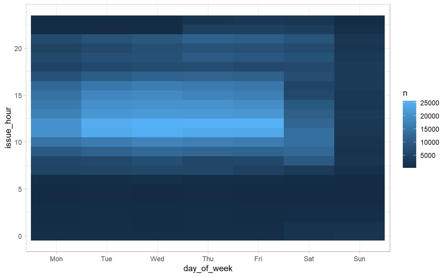
It’s pretty cool we can get a heat map with a few lines of code, but it looks rough and incomplete. We’re going to make a bunch of changes to get something more polished:
- Add light borders to each node to distinguish them more easily
- Add more frequent labels for hours
- Turn the integer hour into a more recognizable time (e.g., 20 becomes 20:00)
- Change the colour – lighter should mean fewer tickets and darker should mean more tickets
- Make the numbers in the scale prettier
- Change the aspect ratio – the default nodes are too wide
- Add a descriptive title
- Get rid of labels for the x and y axes – I don’t need a label to know that “Mon” and “Tue” mean day of the week
- Change the fill label from “n” to something more descriptive
- Change the font – you’ll need the
extrafontpackage for anything but the most basic fonts (it requires a totally-worth-it one-time setup step) - Get rid of gridlines – we already have borders on our nodes
- Get rid of the border around the heat map
- Adjust the x and y axes text sizes
- Get rid of axis ticks on the x-axis (we’ll keep the ones on the y-axis)
tickets_heat_overall <- tickets %>%
  count(day_of_week, issue_hour)

tickets_heat_overall %>%
  ggplot(aes(x = day_of_week, y = issue_hour, fill = n)) +
  # 1. Add light borders
  geom_tile(col = "gray90") +
  scale_y_reverse(# 2. More frequent hour labels
                  breaks = seq(0, 23, 2),
                  # 3. More recognizable hours
                  labels = paste0(seq(0, 23, 2), ":00")) +
  scale_fill_gradient(# 4. Change colour
                      low = "white", high = "#ae017e",
                      # 5. Pretty numbers
                      labels = comma_format()) +
  # 6. Better aspect ratio
  coord_fixed(ratio = 0.3) +
  labs(# 7. Descriptive title
       title = "Philadelphia parking tickets by time and day",
       caption = "Based on 2017 Philadelphia parking tickets for all violation types",
       # 8. Get rid of unnecessary axis labels
       x = "",
       y = "",
       # 9. More descriptive legend label
       fill = "Tickets Issued") +
  theme(# 10. Change font
        text = element_text(family = "Bahnschrift"),
        # 11. Eliminate gridlines
        panel.grid = element_blank(),
        # 12. Eliminate border
        panel.border = element_blank(),
        # 13. Change axis text sizes
        axis.text.x = element_text(size = 14),
        axis.text.y = element_text(size = 11),
        # 14. Eliminate x-axis ticks
        axis.ticks.x = element_blank())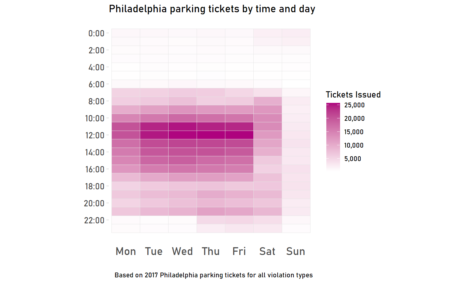
That looks pretty good! We can make a few immediate observations:
- Most tickets are issued on weekdays during the day
- Sunday is the least-ticketed day
- Some tickets are issued late at night on party nights (Thu, Fri, Sat), but not other nights
This heat map includes all violations, regardless of what type they are. What if we look at violation types individually? We can still use a heat map, but break it into small multiples to allow for easy comparison. Let’s look at the five violations that racked up the most tickets. First, though, we need to do two extra steps:
- Turn implicit missing values into explicit missing values. For example, if a given violation type doesn’t have any tickets for 2:00 a.m. on a Sunday, that will show up as “NA” (missing). We want it to show up as “0” instead, otherwise our heat map won’t graph properly. We can use the
completefunction to do this. - Look at percent of tickets issued within each type instead of number of tickets so that everything is on the same scale. If we looked at number of tickets, we couldn’t compare across types because types with the most tickets would automatically be darker.
tickets_heat_top5 <- tickets %>%
  mutate(violation_group = str_to_title(fct_lump(violation_desc, 5))) %>%
  count(day_of_week, issue_hour, violation_group) %>%
  complete(day_of_week, issue_hour, violation_group, fill = list(n = 0)) %>%
  group_by(violation_group) %>%
  mutate(pct_of_group = n / sum(n)) %>%
  ungroup()

tickets_heat_top5 %>%
  mutate(violation_group = fct_reorder(violation_group, pct_of_group, median)) %>%
  ggplot(aes(x = day_of_week, y = issue_hour, fill = pct_of_group)) +
  geom_tile(col = "gray90") +
  scale_y_reverse(breaks = seq(0, 23, 2),
                  labels = paste0(seq(0, 23, 2), ":00"),
                  sec.axis = dup_axis()) +
  scale_fill_gradient(low = "white",
                      high = "#ae017e",
                      labels = percent_format()) +
  coord_fixed(ratio = 0.3) +
  facet_wrap(~ violation_group) +
  labs(title = "Watch where you park",
       subtitle = "Nodes represent % of tickets issued for a given type of violation",
       caption = "Based on 2017 Philadelphia parking tickets",
       x = "",
       y = "",
       fill = "") +
  theme(text = element_text(family = "Bahnschrift"),
        panel.grid = element_blank(),
        panel.border = element_blank(),
        strip.text = element_text(colour = "black", size = 11),
        strip.background = element_blank(),
        axis.text = element_text(size = 7),
        axis.ticks.x = element_blank())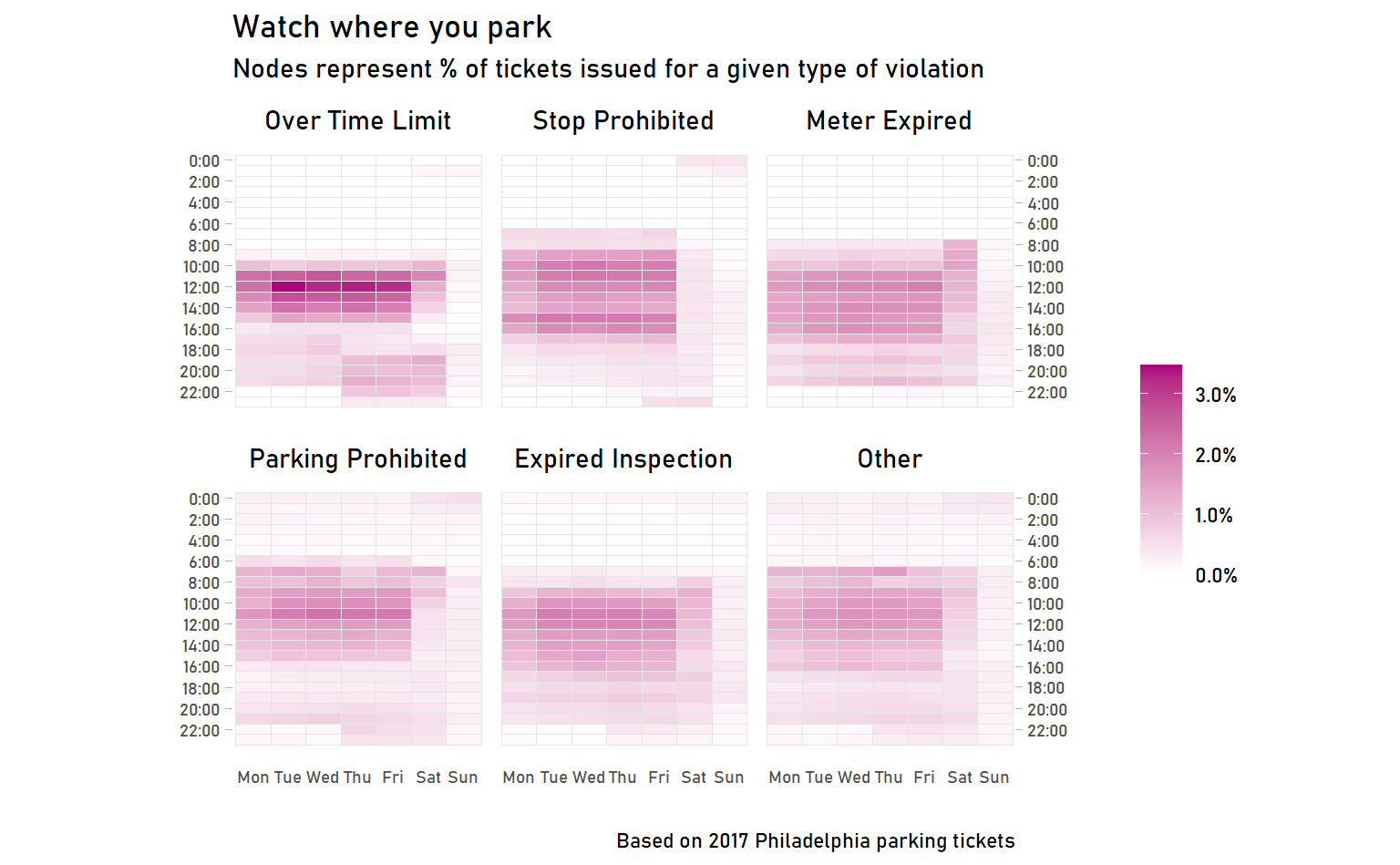
I’ll let you draw your own observations about the differences between violations. (And also identify the pitfalls of drawing conclusions from these heat maps!)
Conclusion
I hope you enjoyed making heat maps and going deep into some of the ways we can tweak the ggplot2 theme to get nicer, more polished graphs. If you liked this, check out the #TidyTuesday hashtag on Twitter or, even better, participate yourself!