In this post, I analyze the Pizza Party dataset from TidyTuesday, a project that shares a new dataset each week to give R users a way to apply and practice their skills. This week’s data is about survey ratings of New York pizza restaurants.
Setup
First, let’s load the tidyverse, change our default ggplot2 theme, and load the data. (I named the dataframe pizza_barstool_raw because I’ll probably add some cleaning steps and I like to have the original data on hand.)
library(tidyverse)

theme_set(theme_light())

pizza_barstool_raw <- readr::read_csv("https://raw.githubusercontent.com/rfordatascience/tidytuesday/master/data/2019/2019-10-01/pizza_barstool.csv")
Data inspection
Let’s take a look!
pizza_barstool_raw %>%
  glimpse()
## Rows: 463
## Columns: 22
## $ name <chr> "Pugsley's Pizza", "Williamsbu...
## $ address1 <chr> "590 E 191st St", "265 Union A...
## $ city <chr> "Bronx", "Brooklyn", "New York...
## $ zip <dbl> 10458, 11211, 10017, 10036, 10...
## $ country <chr> "US", "US", "US", "US", "US", ...
## $ latitude <dbl> 40.85877, 40.70808, 40.75370, ...
## $ longitude <dbl> -73.88484, -73.95090, -73.9741...
## $ price_level <dbl> 1, 1, 1, 2, 2, 1, 1, 1, 2, 2, ...
## $ provider_rating <dbl> 4.5, 3.0, 4.0, 4.0, 3.0, 3.5, ...
## $ provider_review_count <dbl> 121, 281, 118, 1055, 143, 28, ...
## $ review_stats_all_average_score <dbl> 8.011111, 7.774074, 5.666667, ...
## $ review_stats_all_count <dbl> 27, 27, 9, 2, 1, 4, 5, 17, 14,...
## $ review_stats_all_total_score <dbl> 216.3, 209.9, 51.0, 11.2, 7.1,...
## $ review_stats_community_average_score <dbl> 7.992000, 7.742308, 5.762500, ...
## $ review_stats_community_count <dbl> 25, 26, 8, 0, 0, 3, 4, 16, 13,...
## $ review_stats_community_total_score <dbl> 199.8, 201.3, 46.1, 0.0, 0.0, ...
## $ review_stats_critic_average_score <dbl> 8.8, 0.0, 0.0, 4.3, 0.0, 0.0, ...
## $ review_stats_critic_count <dbl> 1, 0, 0, 1, 0, 0, 0, 0, 0, 1, ...
## $ review_stats_critic_total_score <dbl> 8.8, 0.0, 0.0, 4.3, 0.0, 0.0, ...
## $ review_stats_dave_average_score <dbl> 7.7, 8.6, 4.9, 6.9, 7.1, 3.2, ...
## $ review_stats_dave_count <dbl> 1, 1, 1, 1, 1, 1, 1, 1, 1, 1, ...
## $ review_stats_dave_total_score <dbl> 7.7, 8.6, 4.9, 6.9, 7.1, 3.2, ...We have three major categories of data:
- Location: where the restaurants are, including city (borough) and geographic coordinates
- Restaurant: name and price level
- Reviews: review counts scores for four types of reviewers
- Provider
- Community
- Critics
- Dave (Barstool)
We could investigate a lot of things with this data, including where in New York the best pizza places are, how consistent the different types of reviewers are, and whether higher prices mean better pizza.
I want to know, What’s the best (and worst) pizza in New York, for each price level? Next time I visit, I want to know the must-go pizza places (and which ones to avoid) and I want options depending on how much I’m looking to spend.
Data cleaning
Now that we have our research question, let’s clean the data. We will:
- Filter out restaurants outside of New York.
- Add
pizzeria_idas unique ID field for each restaurant. This will help if there are multiple restaurants with the same name. - Ditch location data – it doesn’t help answer our question.
- Rename variables that start with
review_stats_. They’re cumbersome.
pizza_barstool <- pizza_barstool_raw %>%
  filter(city %in% c("New York", # New York is coded two different ways
                     "New York City",
                     "Brooklyn",
                     "Bronx",
                     "Staten Island",
                     "Hoboken")) %>%
  transmute(pizzeria_id = row_number(),
            pizzeria_name = name,
            price_level,
            provider_rating,
            provider_reviews = provider_review_count,
            all_rating = review_stats_all_average_score,
            all_reviews = review_stats_all_count,
            community_rating = review_stats_community_average_score,
            community_reviews = review_stats_community_count,
            critic_rating = review_stats_critic_average_score,
            critic_reviews = review_stats_critic_count,
            dave_rating = review_stats_dave_average_score,
            dave_reviews = review_stats_dave_count)
Two more cleaning steps. First, this data is in a wide format. I want it to be in a tidy format, which is easier to work with. We can do this using gather and spread. After that, we we’ll filter out data that isn’t useful to us – restaurants without zero reviews and the aggregated reviewer “all” (we want the reviewer type to stay unaggregated).
pizza_barstool_tidy <- pizza_barstool %>%
  gather("category", "value", provider_rating:dave_reviews) %>%
  separate(category, into = c("reviewer", "measure"), sep = "_") %>%
  spread(measure, value) %>%
  filter(reviews > 0,
         reviewer != "all")
We’re looking at ratings, which is a continuous variable, so let’s look at the distribution of average scores for each type of reviewer using histograms.
pizza_barstool_tidy %>%
  ggplot(aes(rating)) +
  geom_histogram(binwidth = 1) +  # binwidth = 1 to get clean breaks in histogram
  facet_wrap(~ reviewer) +
  labs(title = "How did different reviewers score restaurants?")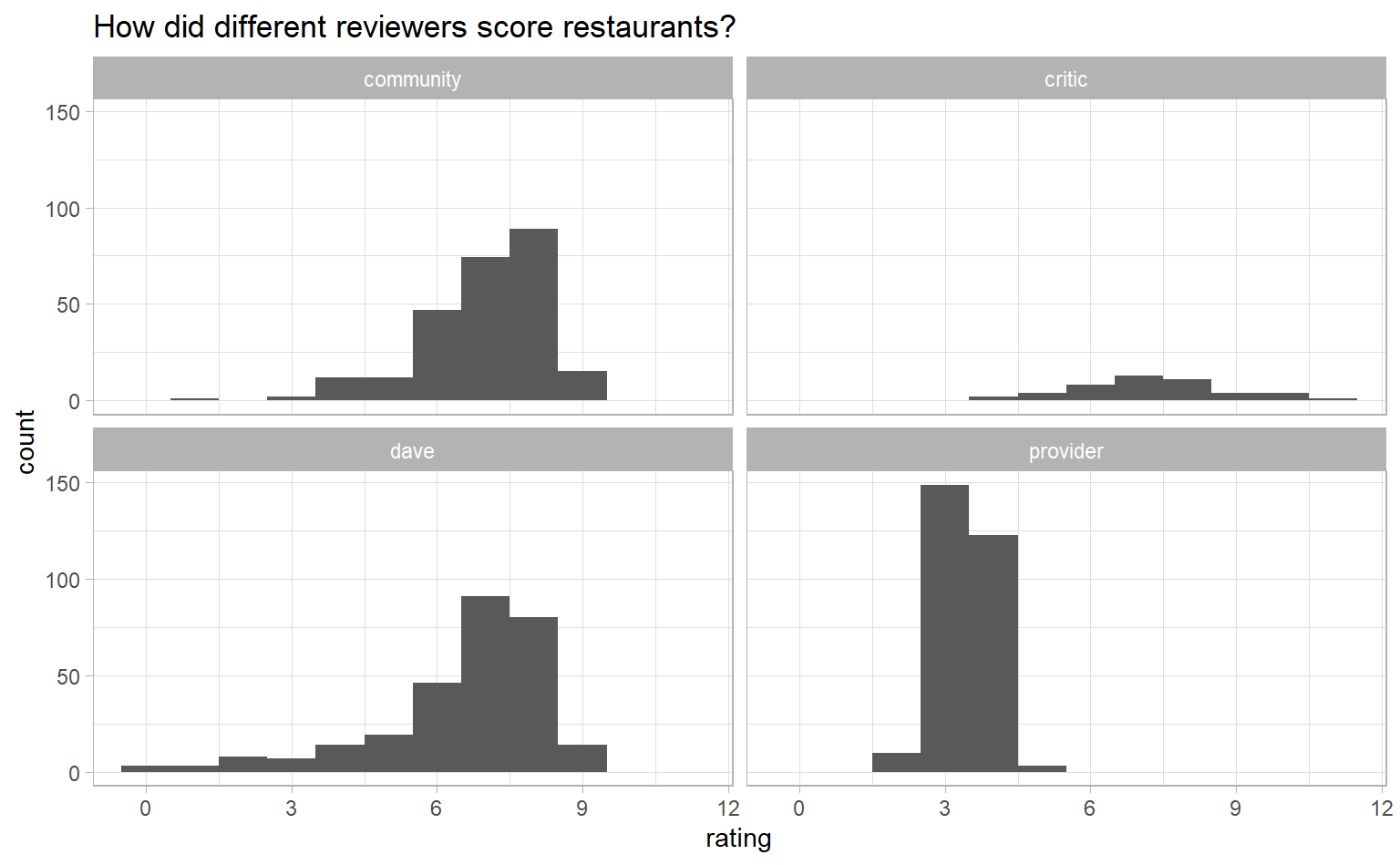
Most reviews are in the 7-8 range, except for provider, which has a lot of 3s and 4s and none over 5. I suspect provider ratings are on a 5-point scale.
pizza_barstool_tidy %>%
  filter(reviewer == "provider") %>%
  count(rating)
## # A tibble: 7 x 2
## rating n
## <dbl> <int>
## 1 2 1
## 2 2.5 9
## 3 3 53
## 4 3.5 96
## 5 4 98
## 6 4.5 25
## 7 5 3
Yep. Let’s double the provider scores so they are on the same scale as the other reviewers. We will lose some nuance, since people may score differently when presented with a 5-point scale compared to a 10-point scale, but I’m comfortable making the that trade-off to get all the scores on the same scale.
pizza_barstool_tidy <- pizza_barstool_tidy %>%
  filter(reviews > 0) %>%
  mutate(rating = if_else(reviewer == "provider", rating * 2, rating))
Visualization
We want to know, What’s the best (and worst) pizza in New York, for each price level? One way to answer that is to determine a typical score for restaurants overall, then calculate which restaurants are farthest away from that typical score. I’m going to use the median as the typical score, since it is less susceptible to extreme values. (For example, some restaurants have a rating of zero and I prefer that those ratings not drag down the typical score too much.)
new_york_pizza <- pizza_barstool_tidy %>%
  mutate(overall_median_rating = median(rating)) %>%
  group_by(pizzeria_id, pizzeria_name, overall_median_rating, price_level) %>%
  summarise(avg_rating = weighted.mean(rating, reviews)) %>%
  ungroup() %>%
  mutate(diff_from_median = avg_rating - overall_median_rating)
## `summarise()` regrouping output by 'pizzeria_id', 'pizzeria_name', 'overall_median_rating' (override with `.groups` argument)new_york_extremes <- new_york_pizza %>%
mutate(direction = ifelse(diff_from_median > 0, "higher", "lower")) %>%
group_by(price_level, direction) %>%
top_n(5, wt = abs(diff_from_median)) %>% # Take top 5 best and worst
ungroup()
Great! The data is in the right format to graph. Let’s do a couple clean-up steps so that our graph looks nice:
- Convert numeric price levels (0-4) to dollar signs ($, $$, etc.).
- Convert
pizzeria_nameto a factor and then re-order it so that, when graphed, they will appear in order from highest- to lowest-rated. - Find nice colours and their hex values from ColorBrewer (I use blue for high score and red for low score).
- Fiddle with some chart elements, like legend, gridlines, and text size.
- Add titles and annotations.
library(tidytext) # Needed for reorder_within and scale_x_reordered functions

new_york_extremes %>%
  # 1. Convert price levels with dollars signs
  mutate(price_level = case_when(price_level == 0 ~ "$",
                                 price_level == 1 ~ "$$",
                                 price_level == 2 ~ "$$$",
                                 price_level == 3 ~ "$$$$",
                                 TRUE ~ NA_character_),
  # 2. Re-order restaurants so they appear from best to worst
         pizzeria_name = reorder_within(pizzeria_name, diff_from_median, price_level),
         avg_rating = round(avg_rating, 1)) %>%
  ggplot(aes(pizzeria_name, diff_from_median, fill = direction)) +
  geom_col() +
  coord_flip() +
  facet_wrap(~ price_level, scales = "free_y") +
  scale_x_reordered() +
  # 3. Get nice colours from colorbrewer2.org
  scale_fill_manual(values = c("#3288bd", "#d53e4f")) +
  # 4. Fiddle with some chart elements
  theme(legend.position = "none", # No legend
        panel.grid.minor = element_blank(), # No minor gridlines
        strip.background = element_rect(fill = NA), # Blank facet title background
        strip.text = element_text(colour = "black", face = "bold", size = 12)) +
  # 5. Add titles and annotations
  labs(title = "What's the best and worst pizza in New York?",
       subtitle = "Broken down by price level",
       x = "",
       y = "Score difference from the median",
       caption = "Based on Barstool, community, critic, and Dave reviews")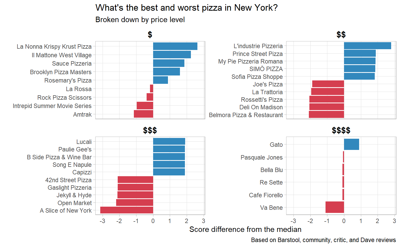
I’m definitely going to L’industrie Pizzeria next time I’m in New York!
Conclusion
If you liked this, check out the #TidyTuesday hashtag on Twitter. People make truly wonderful contributions every week. Even better would be to participate in TidyTuesday. The R community is tremendously positive and supportive.